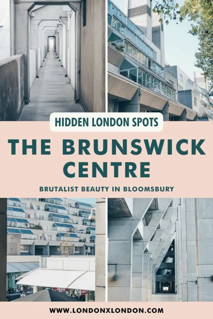
Architectural masterpiece or wantonly ugly eyesore? The debate over Bloomsbury’s Brunswick Centre has raged ever since it opened in the 1960s and shows no sign of abating.
Though the house prices may have gone up, and the once failed shopping centre has been rejuvenated, the visionary design of the Brunswick Centre is just as divisive as ever.
This is, without a doubt, one of London’s most singular Brutalist developments. Surrounded by staid, sensible Georgian terraces, this conflagration of concrete, steel and glass makes little attempt to be sympathetic to its surroundings. Yet it works.
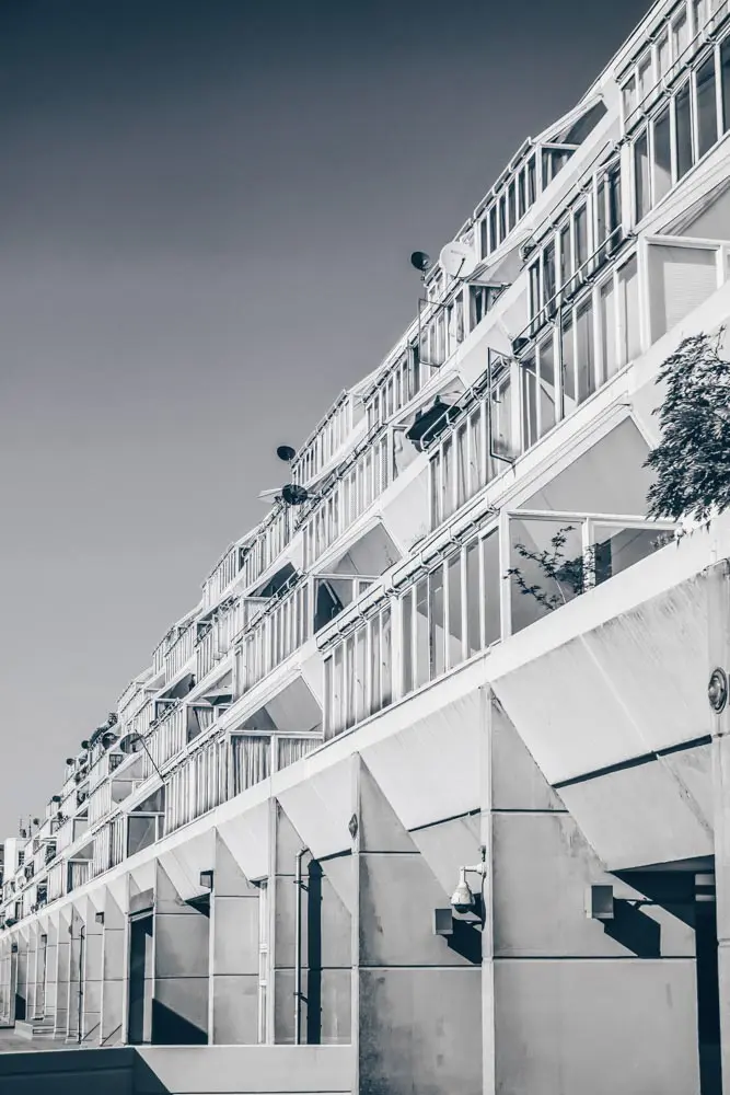
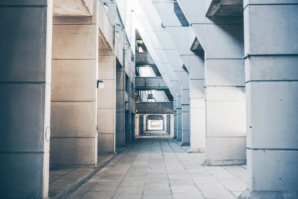
We’re embarrassed to say that we didn’t know much about the Brunswick Centre until we stumbled across it a few years ago on a photographic jaunt around Bloomsbury.
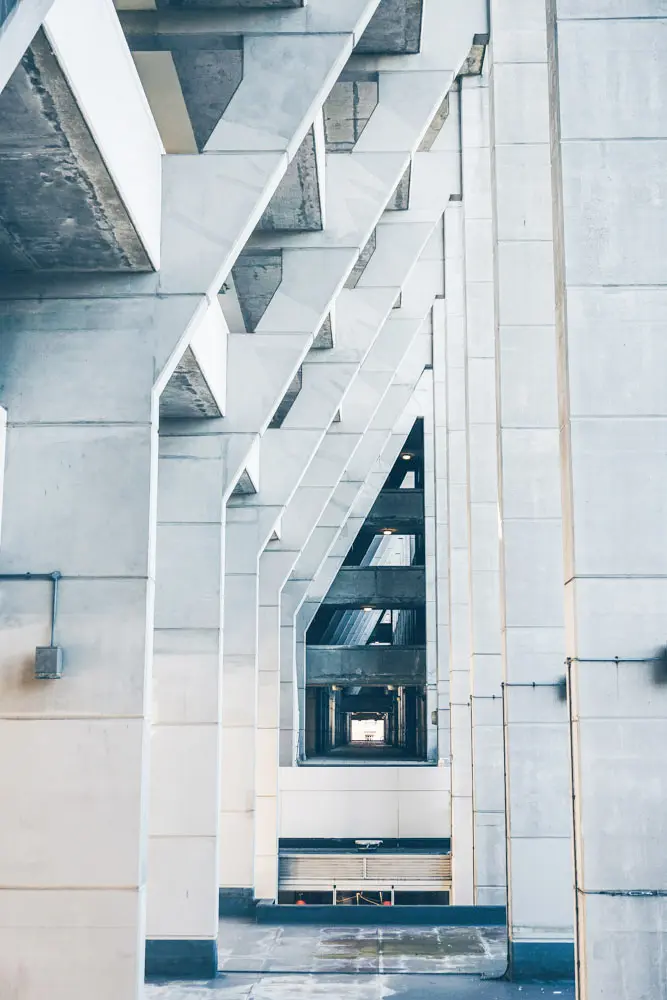
One minute, we were meandering through Russell Square, the next, standing slack-jawed staring at this pale concrete structure: a riot of clean lines, light and shadow, standing in contrast to the blue sky.
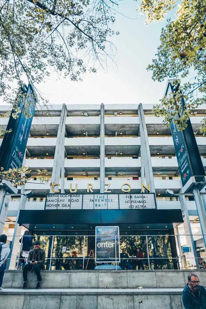
Now there are times in this city when we truly believe that it is our fellow Londoners who make it really shine and this was one of them. A resident who’d spied us photographing the building and clocking the appreciation writ large on my face, offered to let us in to capture The Brunswick’s seldom-seen interior.
“You have to see it, if you think it looks like something from the outside, just wait.”
Well, he was right. The Brunswick Centre went from being a place I’d barely heard about to being one of the hidden gems we always recommend fellow Brutalist fans scope out.
We didn’t catch his name but if you’re reading this, thanks and you’re a hero.
Ready to discover more about The Brunswick? Read on my friends.
Brutalist Design at The Brunswick
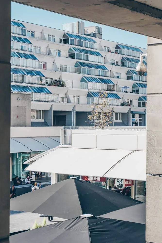
Like many Brutalist buildings, The Brunswick is notable in its placement of utilitarian features front and centre in its design.
It’s the perfect example of form following function – the structure built to enable a holistic community of residents and modern life that still exists several decades later. It was to be a modern village – with family homes, shops and a cinema all within the same complex.
The stepped buildings (which you can also see on the cool Alexandra Road Estate too) allows plenty of space and light for each resident, whilst the eight pairs of ventilation towers provide ventilation to the buildings and lend visual appeal to the structure.
While it’s a very different architectural style to the Georgian buildings surrounding it, the building’s cream colour (finally applied in the noughties) ties it in with their stucco facades.
But, successful as it is today, The Brunswick hasn’t always enjoyed such a stellar reputation.
The History of the Brunswick Centre
Initial Plans
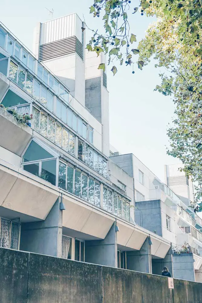
The Brunswick Centre was built in 1967-1972 – originally intended as a mixed-use development with a shopping centre and cinema below, and private residential accommodation above.
It replaced a few overcrowded terraces of Georgian houses on the estate of the Foundling Hospital.
The idea was simple: that the developer would build The Brunswick, lease the shops, sell the flats and pocket the profits… except it didn’t quite work out like that.
The first hiccough was the London County Council (LCC): more specifically the height restrictions it had on buildings in London.
That resulted in an overhaul of the proposed 25-storey design.
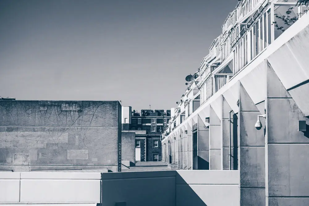
Leslie Martin, an architect known for his ambitious low-rise developments, was consulted, though he referred it to a colleague Patrick Hodgkinson. It was Hodgkinson who ended up designing the development.
The new plans still allowed for a high number of residential units and a lower (acceptable) height – bisected on the ground level by a series of commercial units running though its middle.
A Rather Embarrassing Failure?
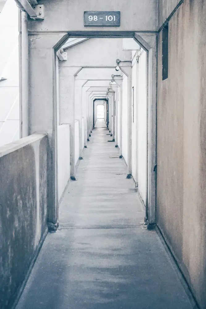
A much bigger issue arose later down the line – as it neared close to completion, it became clear that there wasn’t enough appetite for the flats to make the scheme a commercial success.
The original developer went bankrupt and the project was sold to Sir Robert McAlpine Construction.
This also resulted in negotiations to lease the residences to Camden Council for social housing… and a number of cuts from the development’s intended finishing touches. Hodgkinson stood down from the job before it was completed, unhappy with the heavily compromised version of the development adapted from his designs.
Noughties Revival
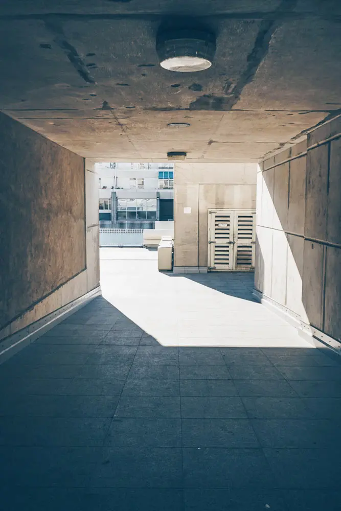
For a long time, The Brunswick was seen as a rather embarrassing failure. It became run down and skirted on the unsavoury side of things… until the tide started to change in the early noughties.
First up was its listing by English Heritage in the year 2000.
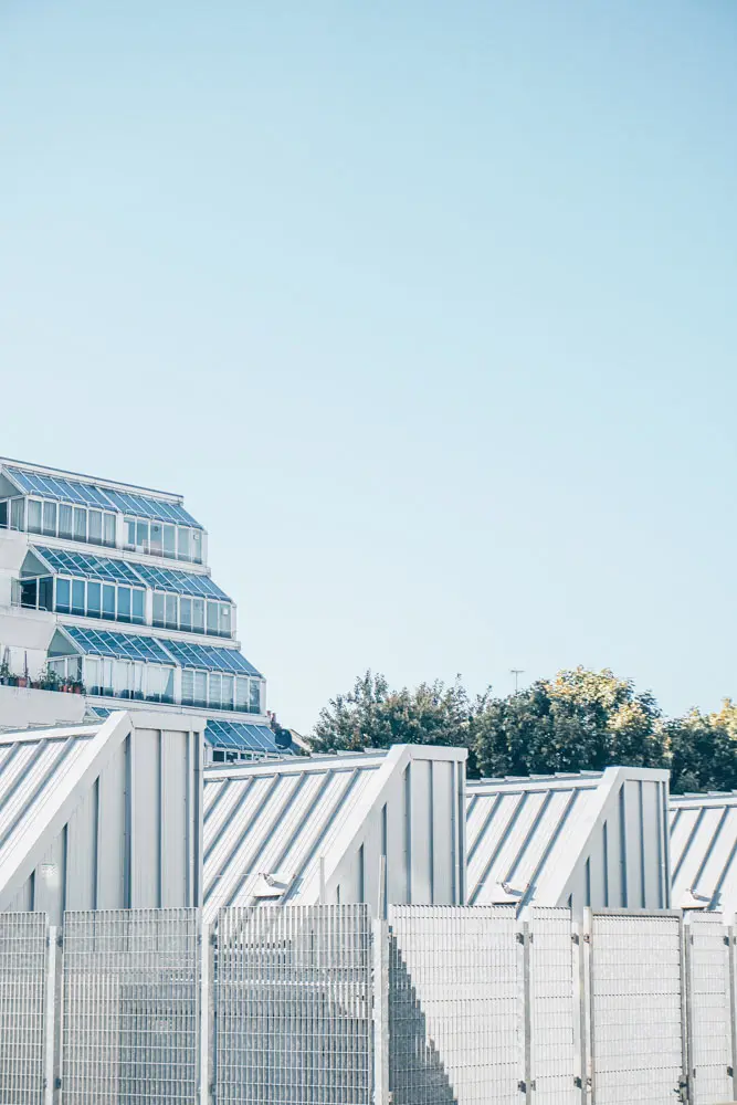
Restoration and renovation were soon to follow: the development was finally painted in the blue and cream colour scheme originally intended by Hodgkinson and a number of high-profile tenants (including Waitrose and Hobbs) moved into the commercial premises. Hodgkinson himself oversaw the renovation after he was invited back to realise his original design in the late 1990s – a process that was completed in 2006.

The most significant thing to take away from its renovation is that it mainly pushed forward with the design that Hodgkinson had originally intended – and is now a roaring success.
These days, The Brunswick has enjoyed a resurgence in popularity. It’s a well-known and well-loved (though not universally) spot in Bloomsbury: a testament to London’s ever changing tastes and whims.
We love it and have added it to our ever increasing list of cool places we’d love to live in London at least once. In case, you know, we win the lottery five times in a row.
Map
Read More Hidden London Guides
- The Bloomsbury Area Guide
- These Buildings are the Best of Brutalist London
- Ready to Explore: The Seven Noses of Soho
- The History of Trellick Tower: Bold and Brutalist Beauty
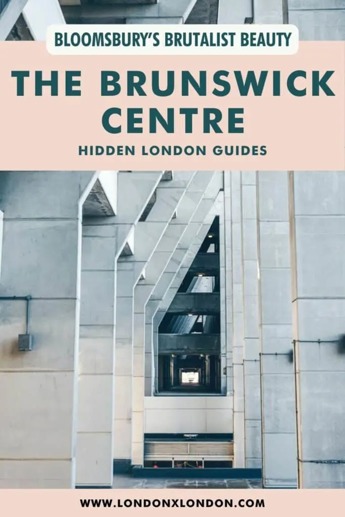
Save and Share on Pinterest!
